Charming Cottage Style Bathroom Reveal
Interior design: thekwendyhome Photography: @Janetkwan
We were saving for the principle bathroom and intended to live and use the guest bathroom as we saved up for the big overhaul. But it wasn't in our cards when not one but THREE leaks sprung up in the guest bathroom. Right above our newly finished kitchen.
So we just pivoted and used what we had saved for the principle bathroom and allocated it to the guest bathroom. When I was sourcing material, our primary concern was availability since this was our only fully functioning bathroom. This meant that some of these purchases were more expensive than what I would normally choose because we couldn't wait months for a cheaper shower kit to arrive.
Here is what the bathroom looked like before.
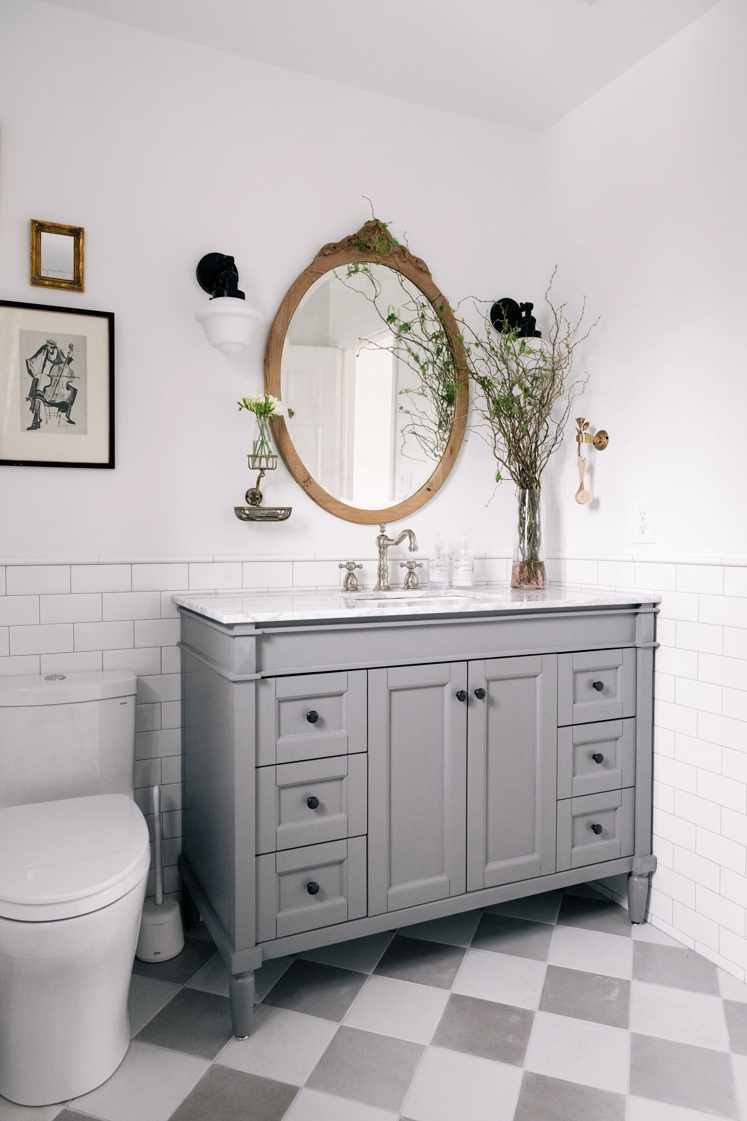
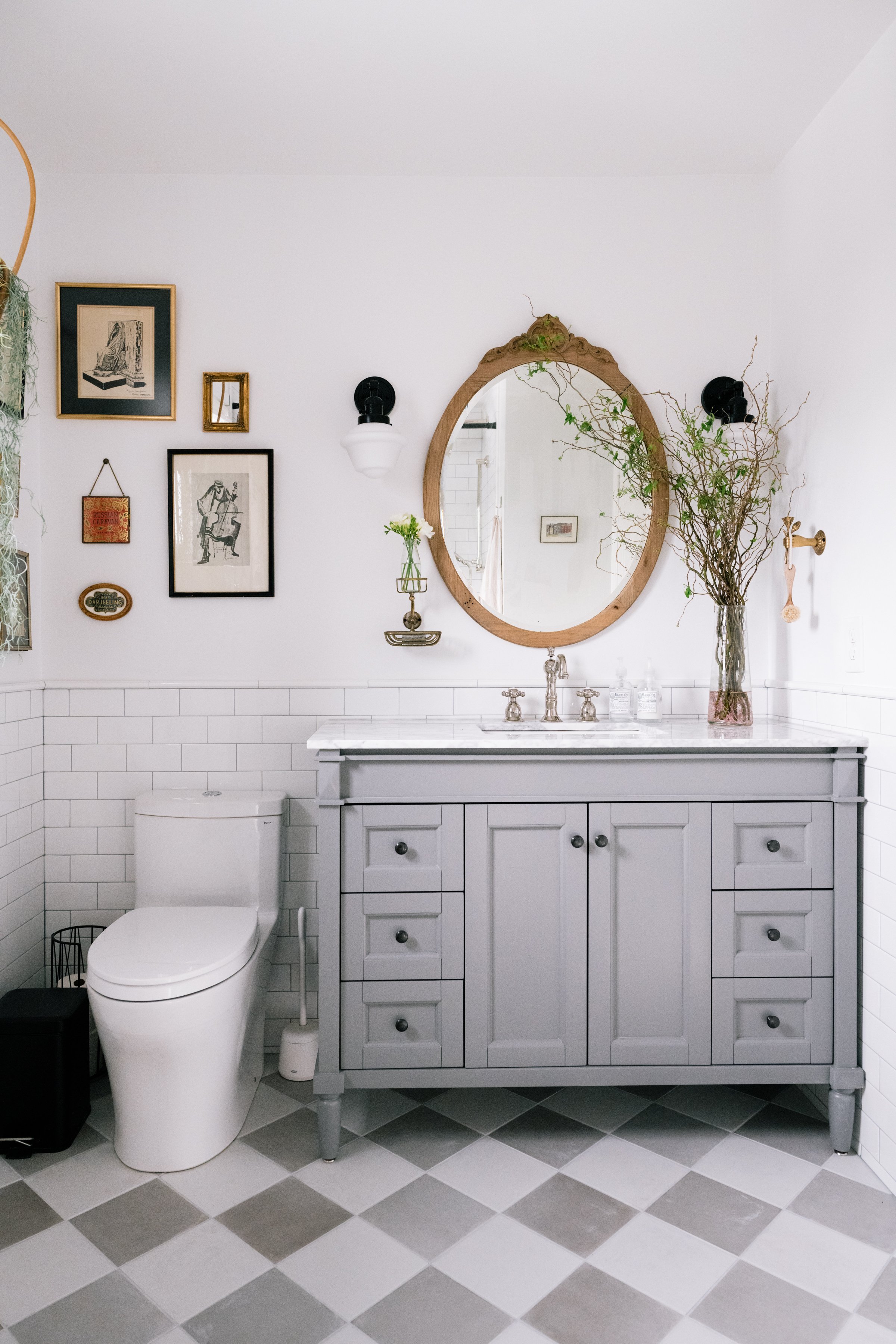
And here is what it looks like now. I love it so much. It feels more in line with the style and exterior of the house too. My goal with this builder grade home was to bring back some charm into it and I think we accomplished that here.
I chose to do subway tiles 1/3 of the way up the walls around the perimeter of the bathroom. Subway tiles are readily available, affordable and is such a classic look. The grout colour we chose is Vapour Grey which is also used in our kitchen as well.
Interior design: thekwendyhome Photography: @Janetkwan
My favourite part of the subway tile feature we decided to do was finishing it off in a pencil tile as oppose to a bullnose tile. It has that retro feel to it and gives it that extra detail. In our last guest bathroom, I did the entire wall of the vanity in subway tile. I think it's a great feature that is also highly practical especially for kids bathrooms. It's easy to clean and protects your drywalls from water damage.
Interior design: thekwendyhome Photography: @Janetkwan
Interior design: thekwendyhome Photography: @Janetkwan
But the real feature are these floors. I chose an 8 x 8 tile and opted to do a checkered diamond feature on the floors to add some pizzazz. It's charming, classic and this design feature is making a come back. I would have loved to do it in marble but our budget this time around did not allow for us to do that. There were other things I rather splurge on.
Namely the shower kit we chose.
Interior design: thekwendyhome Photography: @Janetkwan
Interior design: thekwendyhome Photography: @Janetkwan
Interior design: thekwendyhome Photography: @Janetkwan
This fixture was a splurge item. We wanted a shower kit with a rain fall shower head, a hand held and a tub filler. I chose a polished nickel finish because it is a warm metal in an Edwardian style with cross knobs. I find them so whimsical and elegant.
It's also why we decided to do a tub here instead of a free standing shower stall as that was more expensive in labour and in material to do.
We allocated our budget where it mattered most to us, and the shower experience won over marble floors and walk in showers.
Interior design: thekwendyhome Photography: @Janetkwan
Here you can see the polished nickel finish repeat itself in the faucet and again, I chose cross knobs as well. But I didn't go match-y match-y with this bathroom. I wanted to mix metals in this small space.
Interior design: thekwendyhome Photography: @Janetkwan
Interior design: thekwendyhome Photography: @Janetkwan
Interior design: thekwendyhome Photography: @Janetkwan
Interior design: thekwendyhome Photography: @Janetkwan
Interior design: thekwendyhome Photography: @Janetkwan
I wanted to stick to warm metal finishes like polished nickel. So I opted to accent with antique brass details. You can see the antique brass in the towel bar, toilet paper holder, soap holder, robe hook, picture frames and hand towel holder. It's all in the fun little details.
But you'll notice that I also added in a big dose of black metal finishes as well. I find black finishes a neutral in design and I think it worked really well to ground the space and give it that high contrast look I've always been drawn to.
Interior design: thekwendyhome Photography: @Janetkwan
Interior design: thekwendyhome Photography: @Janetkwan
You see the black in the sconces, vanity door knob artwork, picture frame, garbage can and toilet paper holder. Repeating the black throughout the space gave it a cohesive and intentional look that pulls the bathroom together very well.
Interior design: thekwendyhome Photography: @Janetkwan
Interior design: thekwendyhome Photography: @Janetkwan
The vanity we chose was actually the jumping point in this entire design process. Namely because it was readily available to us at the time in a big box store and it was the best looking one I could find that checked off the boxes. I wanted a freestanding piece that looked like a piece of furniture with some classic details in the size we needed for the space.
The warm grey was what decided the tiles for us since this was the piece that was hardest to source at the time. (Delivery time and supply shortages really played a huge role in this renovation and design process since we didn't have the luxury to wait.)
This vanity gives a good amount of storage and comes with a marble top which was a huge plus. I did spray paint the brushed nickel knobs black though since the brushed nickel finish wasn't used elsewhere in the bathroom.
There is a good amount of thrifted and vintage elements in this bathroom. My main design objective for this project was to bring back more charm into this builder grade home so it makes sense to incorporate a lot of these pieces.
Namely in the oval wooden mirror, the stool, plant basket, all the frames and even some of the artwork.
Interior design: thekwendyhome Photography: @Janetkwan
I love this corner gallery wall we did here. The frames tied in the black and aged brass finishes of the bathroom so well. It also gives a lot of interest in bathroom while being very budget friendly since most of these frames were thrifted over time. I also love that gallery walls are an unexpected element in a bathroom.
This bathroom was a fast reno but I think we put a lot of heart and effort into it. I really love how it came together and couldn't be prouder.
Sources
Tiles:
Bathtub:
Oval Mirror is vintage here are some alternatives. (oval wood, rope beloved, distressed wood)
Soap bar holder (vintage)
Shelf bracket for plant
My gallery wall was all thrifted but here are some pretty vintage and new frames I found.
Gallery Wall
Thanks for reading,


